
Upgrade Your Identity
Branding and UI for a simplified email address ending in @chicago.com
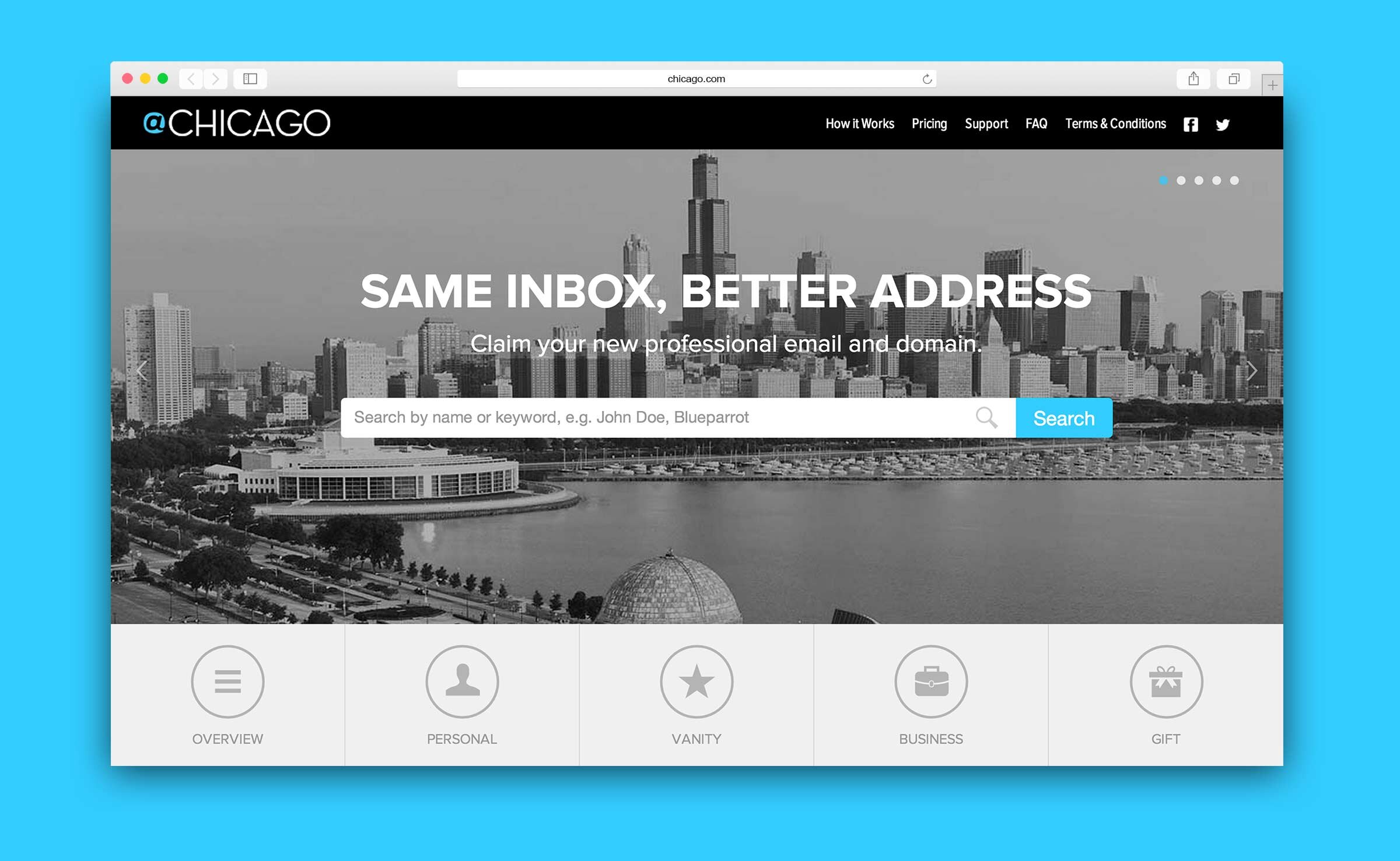
Remember the early days of the internet when unsightly yet well-intentioned email addresses were the norm? This service helped users claim a new, professional email address ending in “@chicago.com”. I created and executed a branding campaign that showcased the benefits of upgrading an embarrassing email address and contributed to the site visuals and user experience.
01
UX/UI Design
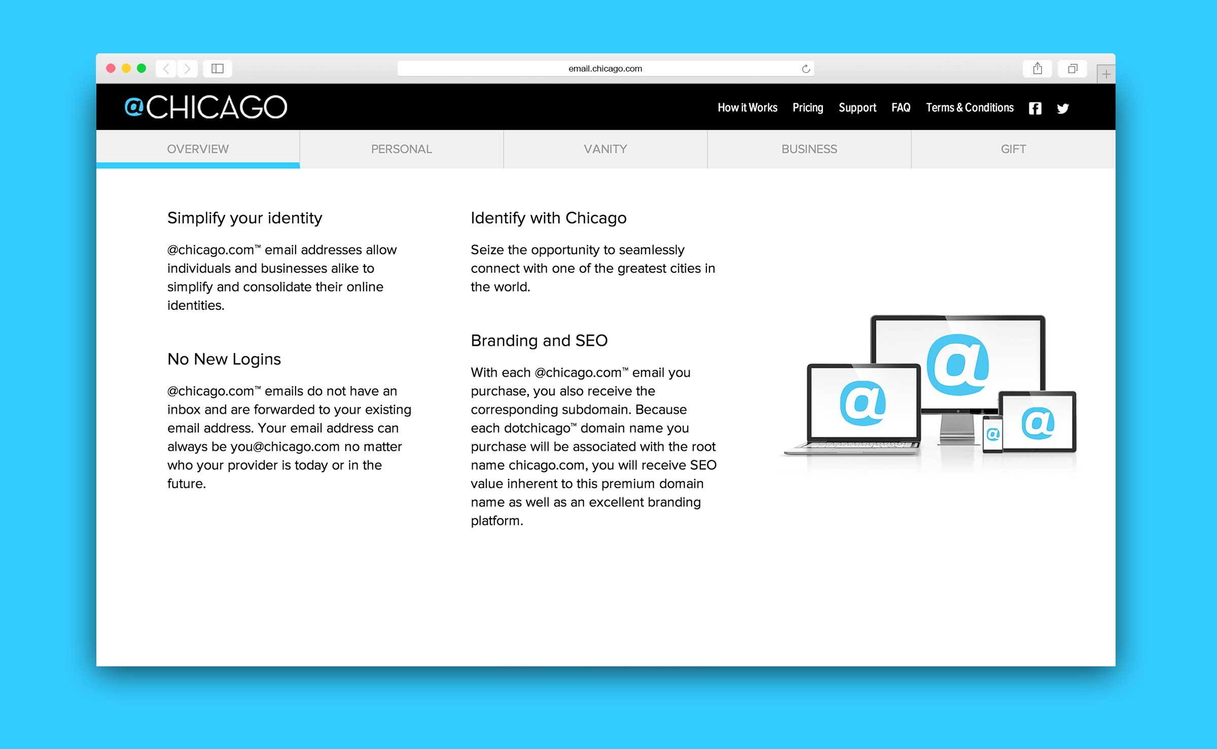
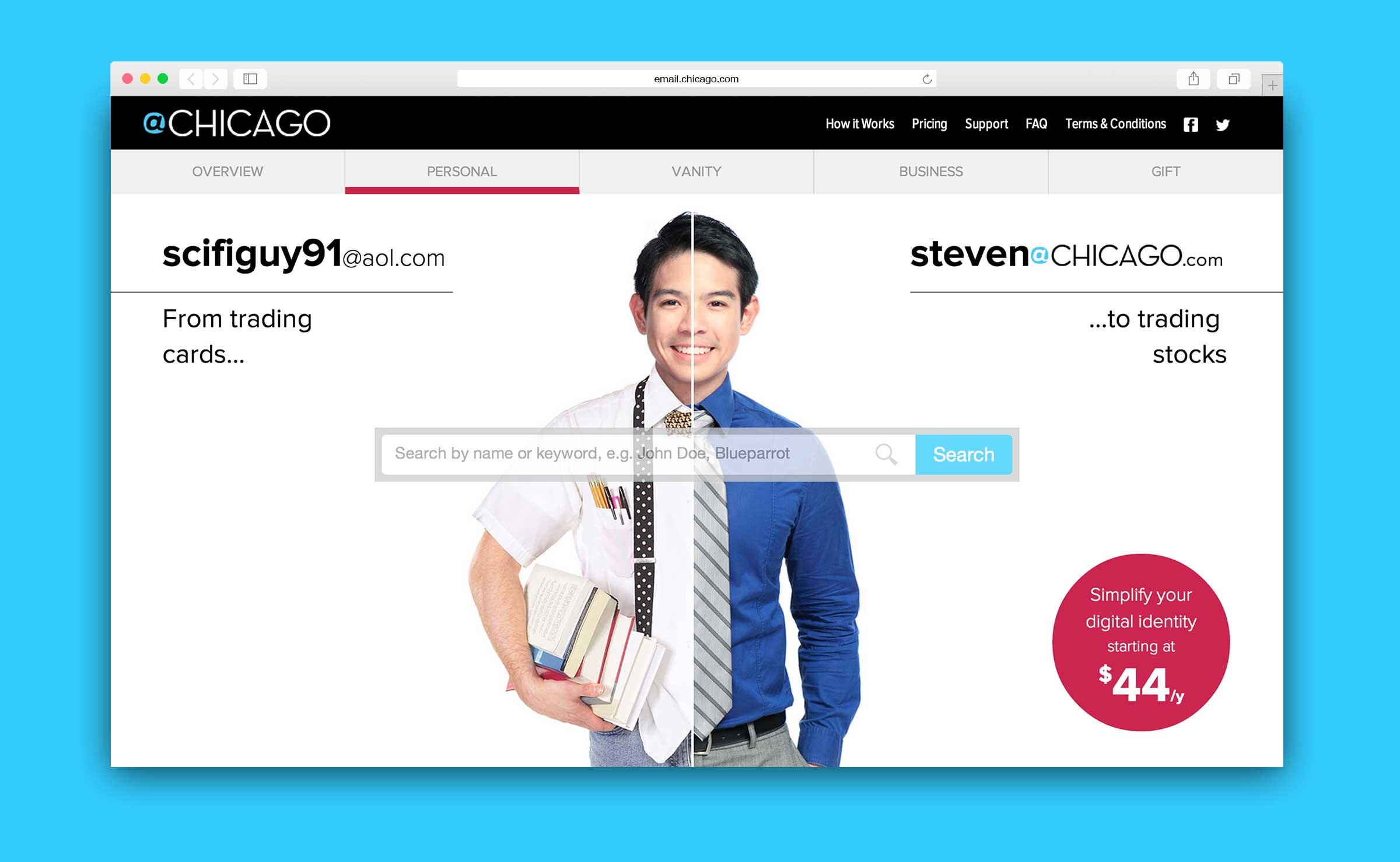
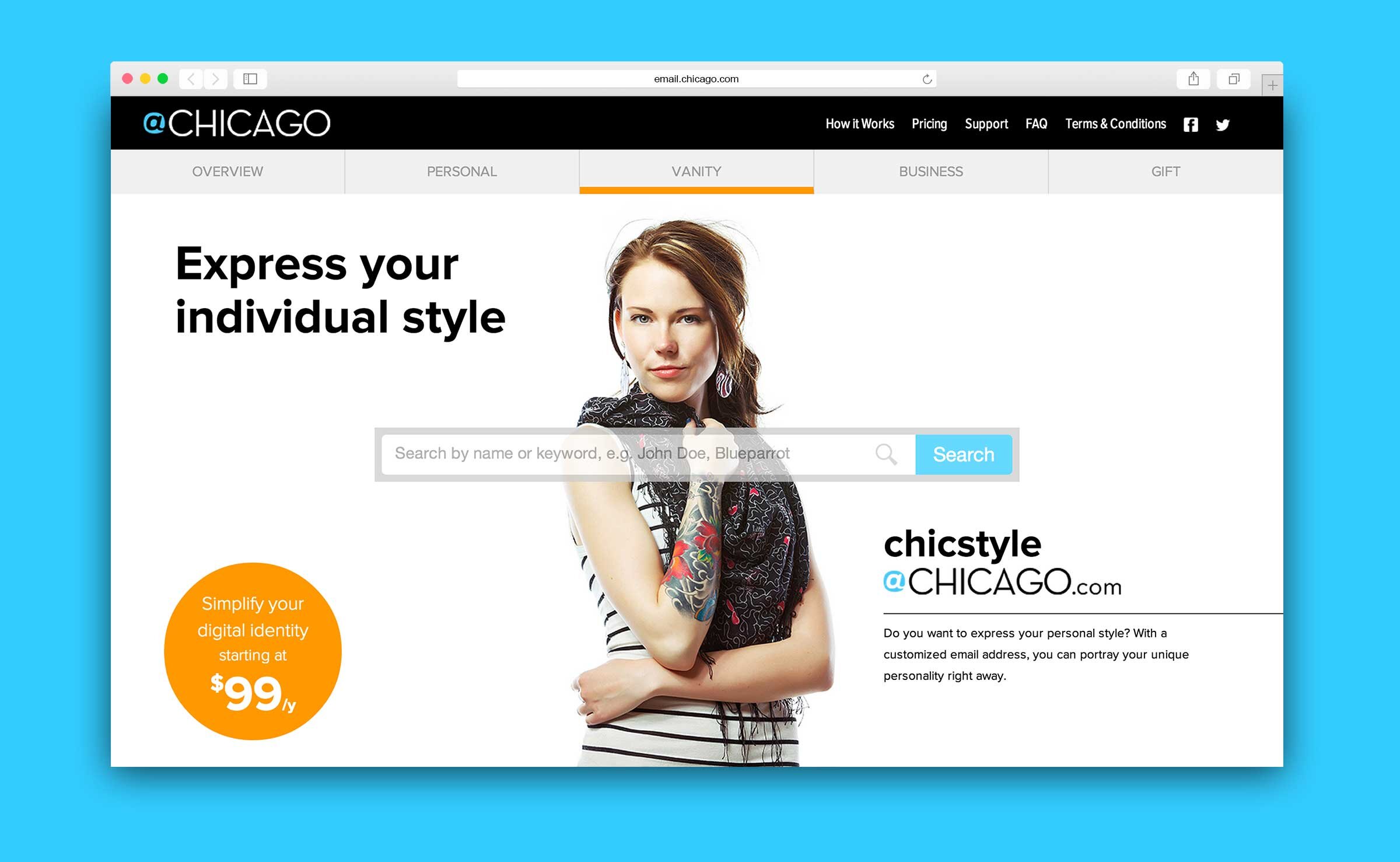
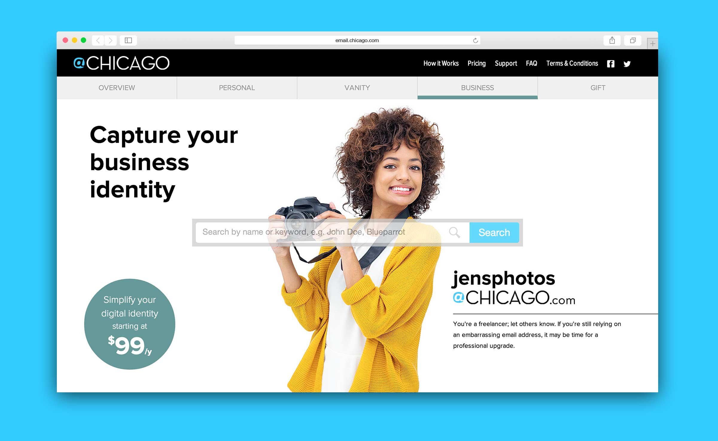
Our goal for the site was to distinguish the different brand categories while still emphasizing the main CTA—searching for an available email address. We achieved this by putting the search field front and center while rotating through various examples. We also included a homepage and an overview of benefits.

02
Digital Media
I created a storyboard and wrote the script for an explanatory video to use on the site that emphasized the key benefits of signing up. To raise awareness for the product, I recut the video to use on digital billboards at public transit stations throughout the city.

Explanatory video

Short digital CTA ad
03
Print Marketing
I rounded out the campaign by designing static billboards strategically placed at high-traffic transit stations and “rack cards” inserted into newspaper boxes around the city.


